Image list
The Image List Section in Shopify allows you to display multiple images in a customizable grid or carousel format. It’s perfect for showcasing product categories, brand visuals, or featured collections. You can adjust the layout, spacing, colors, and interactive elements to enhance user experience.
Navigate to Shopify Admin > Online Store > Themes.
Click Customize on your active theme.
Select Add Section > Image List.
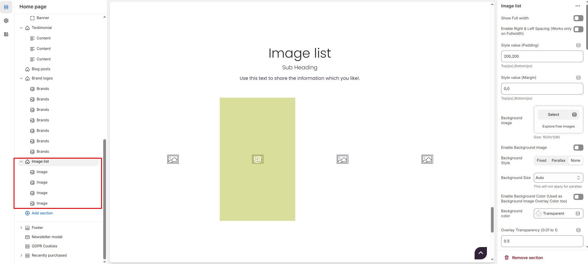
Image List Section Settings
Show Full Width: Expands the section across the entire screen width.
Enable Right & Left Spacing(Works only on fullwidth): Adds spacing on both sides (Works only in Full Width mode).
Padding (Top, Bottom): Adjust the inner spacing above and below the section. Top(px), Bottom(px).
Margin (Top, Bottom): Adjust the outer spacing above and below the section. Top(px), Bottom(px).
Background Image: Upload the image.
Enable Background Image: Allows adding a background image for the section.
Background Style: Choose background style ( Fixed, Parallax, or None ).
Background Size: Choose background size ( Auto, Cover, Contain, Repeat).
Enable Background Color (Used as Background Image Overlay Color too): Enable or disable the overlay effect to the background.
Background Color : Customize the background color (Set Your Preferred Color).
Overlay Transparency: Adjust the transparency of the overlay (value between 0.01 and 1).
Main Heading: Customize the Main heading.
Sub Heading: Add a short text to the content.
Description: Add text to share information about the section.
Link Text: Customize the text for the clickable link.
Link URL: Paste a URL or search for an internal link.
Section Color Settings
Heading Color: Customize the main heading color (Set Your Preferred Color).
Sub Heading Color: Customize the sub-heading color (Set Your Preferred Color).
Description Color: Customize the description text color (Set Your Preferred Color).
Button Background Color: Customize the button background color (Set Your Preferred Color).
Button Text Color: Customize the button text color (Set Your Preferred Color).
Button Hover Background Color: Customize the hover background color of the button (Set Your Preferred Color).
Button Hover Text Color: Customize the button text color on hover (Set Your Preferred Color).
Heading Position : Choose heading position ( Center, Left, Right ).
Block Settings
Items per Row: Choose the number of items displayed per row .
Column Gap: Customizer spacing between columns.
Gallery Link Text: Customize the text for the clickable link.
Gallery Link URL: Paste a URL or search for an internal link.
Item Height Settings
Customize height based on device
Recommended Minimum Slide Heights: Desktop – 450px | Laptop – 400px | Tablet – 350px | Mobile – 300px (You can set the responsive size as per your needs.)
Image Link Color settings
Gallery Link Background Color: Customize the gallery link background color (Set Your Preferred Color).
Gallery Link Text Color: Customize the gallery link text color (Set Your Preferred Color).
Gallery Link Hover Background Color: Customize the gallery link hover background color (Set Your Preferred Color).
Gallery Link Hover Text Color: Customize the gallery link hover text color (Set Your Preferred Color).
Gallery Icon Color: Customize the gallery icon color (Set Your Preferred Color).
Gallery Overlay Color: Customize the gallery overlay color (Set Your Preferred Color).
Icon Size: Adjust the icon size (Eg.,24)
Carousel Settings
Enable Carousel: Activate the sliding effect for product display.
Adjust Space: Allows space adjustment if pagination is disabled.
Enable Auto Height: Adjusts height automatically based on content.
Slides per Row[Desktop] : Customize the values for Desktop. Maximum of 2 slides, if list view is enabled.
Slides per Row[Laptop] : Customize the values for Laptop. Maximum of 2 slides, if list view is enabled.
Slides per Row[Tablet] : Customize the values for Laptop. Maximum of 1 slides, if list view is enabled.
Slides per Row[Mobile] : Customize the values for Laptop. Maximum of 1 slides, if list view is enabled.
Autoplay Timing: Adjust rotation speed (Use 0 to disable autoplay).
Enable Carousel Pagination: Display pagination dots for navigation.
Carousel Pagination Alignment: Choose pagination alignment (Left Aligned, Center Aligned, Right Aligned).
Enable Navigation Arrows: Enable next/previous arrows for navigation.
Navigation Arrows Position: Choose navigation arrow position (Top left, Top center, Top bottom, Center, Bottom left, Bottom center, Bottom right).
Center Navigation Alignment: Choose navigation alignment (Outside container, Along with container or Inside container).
Navigation Button Background Color: Customize the background color (Set Your Preferred Color).
Navigation Button Icon Color: Customize the icon color (Set Your Preferred Color).
Navigation Button Hover Background Color: Customize the hover background color (Set Your Preferred Color).
Navigation Button Hover Icon Color: Customize the hover icon color (Set Your Preferred Color).
Navigation Dot Color: Customize the color of navigation dots (Set Your Preferred Color).
Navigation Dot Active Color: Customize the active navigation dot color (Set Your Preferred Color).
Advanced Customization
Custom Class: The Shopify allows you to apply unique CSS styles to specific sections, blocks, or elements within your theme.
Steps To Add Image list
Without adding block to image list the section seems to be empty
Image list (Block): On adding Image list section blocks add default to it. The blocks can be deleted using Delete icon can hide using Eye icon and be added using Add Image
Image : Upload the image (Recommended size based on design requirements).
Font Awesome icon class : Add the font awesome icon (Eg., fa fa-instagram).
Image Title : Customize the image title.
Link : Add a destination URL (optional) to direct users to the brand's page.