Appearance
The Appearance Settings page allows users to customize the overall look and feel of the theme, including colors, layout, typography, and button styles. These settings help in achieving a visually appealing and consistent design for the store.
Log in to your Shopify admin.
Navigate to Online Store > Themes.
Locate the theme you want to edit and click Customize.
In the Theme Editor, go to Theme Settings > Appearance.
Appearance Customization Options
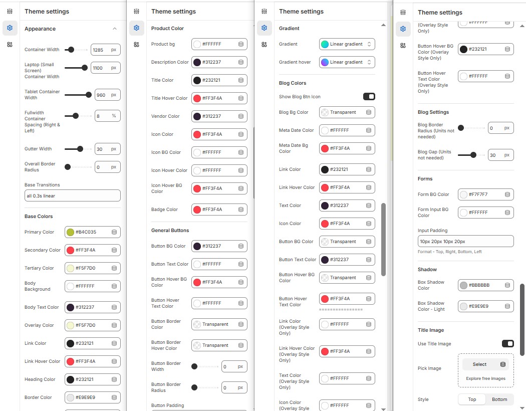
Container Width : In the ContainerWidth Option, You can set the width to the container of the page in pixels for desktop, laptop, and tablet views.
Fullwidth Container Spacing (Right & Left) : Adds spacing on both sides (Works only in Full Width mode).
Gutter Width : Customize spacing between columns.
Overall Border Radius : The border corners can be rounded using the theme border-radius property. (Leave empty for default border radius).
Base Transitions : Customize animation speed for interactive elements.
Base Colors
Primary, Secondary & Tertiary colors: The color commonly use to alter the base color of the theme (Set Your Preferred Color).
Body Background Color & Body Text Colors : Customize body background color and text colors for readability (Set Your Preferred Color).
Overlay Colors : Customize overlays color (Set Your Preferred Color).
Link & Link hover Color : Provides the color for the anchor tag (Set Your Preferred Color).
Heading Color: Provides the color for the Heading (Set Your Preferred Color).
Border Color : Provides the border color of the theme (Set Your Preferred Color).
Error, Success, Info & Warning Colors : Define alert colors for messages (Set Your Preferred Color).
Product Color
Product Bg : Add on Background to the product card (Set Your Preferred Color).
Description Color:and body content of product (Set Your Preferred Color).
Title Color: Add on the color to the heading content.
Title Hover Color : Provides an hover color to the title (Set Your Preferred Color).
Vendor Color : Provide color to the vendor tag of the product (Set Your Preferred Color).
Icon Color: Provide color to the icon (Set Your Preferred Color).
Icon Bg Color: Provide Background color to the icon (Set Your Preferred Color).
Icon Hover Color:Provide hover color to icon (Set Your Preferred Color).
Icon Hover Bg Color : Provide hover background Color for icon(Set Your Preferred Color).
Badge Color : provides color to the badge of product (Badge : sale, new) (Set Your Preferred Color)..
General Button
Button BG Color: Set a background color to the button (Set Your Preferred Color).
Button Text Color: Set a text color to the button (Set Your Preferred Color).
Button Hover BG Color: Set a background hover color to the button (Set Your Preferred Color).
Button Hover Text Colors : Set a text hover color to the button (Set Your Preferred Color).
Button Border Color : Used to set button border color(Set Your Preferred Color).
Button Border Hover Color : Used to set button border hover color (Set Your Preferred Color).
Button Border Width : Use to alter the width of the border.
Button Border Radius : The button shape and size can be adjust using radius (for rounded 50%) .
Button Padding : Use to add inner space to the button.
Gradient
Gradient : Add gradient color to the button on selecting the dropdown and adjusting the range.
Gradient Hover: Add gradient hover color to the button on selecting the dropdown and adjusting the range.
Blog Color
Show Blog Btn Icon : On enabling the option its allows to add an icon to the button.
Blog Bg Color : Use to add background color to the blog (Set Your Preferred Color).
Meta Date color: Its allows to add color to the blog date (Set Your Preferred Color).
Meta Date Bg color : Its allows to add background color to the blog date (Set Your Preferred Color).
Link Color: Allows to add color to anchor tag (Set Your Preferred Color).
Link hover color : Allows to add hover color to anchor tag (Set Your Preferred Color).
Text color : Allow to add color to the body text (Set Your Preferred Color).
Icon Color : Allow to add color to the blog icons (Set Your Preferred Color).
Button Bg Color: Set a background color to the button (Set Your Preferred Color).
Button Text Color : Set a text color the button (Set Your Preferred Color).
Button Hover Bg Color: Set a background hover color to the button (Set Your Preferred Color)
Button Hover Text Color : Set a text hover color to the button (Set Your Preferred Color).
Link Color ( Overlay Style Only ): Allows to add color to anchor tag only for the overlay style (Set Your Preferred Color).
Link Hover Color( Overlay Style Only ): Allows to add hover color to anchor tag only for the overlay style (Set Your Preferred Color).
Text color ( Overlay Style Only ): Allow to add color to the body text in overlay style (Set Your Preferred Color).
Icon Color ( Overlay Style Only ): Allow to add color to the blog icons in overlay style (Set Your Preferred Color).
Button Bg Color ( Overlay Style Only ): Set a background color to the button in overlay style (Set Your Preferred Color).
Button Text Color ( Overlay Style Only ): Set a text color to the button in overlay style (Set Your Preferred Color).
Button Hover Bg Color ( Overlay Style Only ): Set a background hover color to the button in overlay style (Set Your Preferred Color).
Button Hover Text Color( Overlay Style Only ) : Set a text hover color to the button in overlay style (Set Your Preferred Color).
Blog Settings
Blog Border Radius (Units not needed): The button shape and size can be adjust using border radius (for rounded 50%).
Blog Gap (Units not needed) : Allows to set gap to the blog.
Forms
Form Bg Color: Allows to set the background color to the form (Set Your Preferred Color).
Form Input Bg Color: Add background color to the input form (Set Your Preferred Color).
Input Padding: Use to add inner space to the input(Format - Top, Right, Bottom, Left).
Shadow
Box Shadow Color: Allow you to control how light or dark the shadow appears with color options (Set Your Preferred Color).
Box Shadow Color - Light : Allow you to control how light or dark the shadow appears with color options (Set Your Preferred Color).
Title Image
Enable Title Image: Enable or disable the title image.
Pick Image: Upload the image (Recommended size based on design requirements).
Style: Choose the style (Top or Bottom ).